Category Archives: Platform

Bold Text

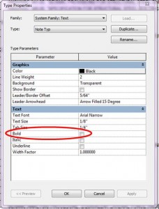
This question came up in my office yesterday so I thought I would share the answer.  If you want bold text, there are two ways to get it.  Of course you can always choose a bold font, such as Arial Bold, but here are the other two options:  The first option is to make a text type that has “bold” checked in the type properties.


Alternately, once a particular portion of (or all) text within a text box is highlighted, the bold button appears on the Contextual Tab.

One should note, however, that the bold button will remain grayed out until text is highlighted.  So simply selecting a text box will not make this option available.

The first method should be utilized if all text in a particular text box is to be bold, and the second method should be used for large note blocks where only a portion of the text needs to be bolded.

Move with disjoin

I found another nice little feature (some might call a bug) about using the Move command while having the disjoin checkbox on.  The point of this option is to allow a user to move an element, say wall or beam, that is joined on either end and break that connection during the move process.

What might not be totally apparent is this will also disjoin it from everthing, if you had dimensioned to that wall the dimensions are gone etc.  If you move a level everything associated with the levels gets deleted (views, walls, columns etc.).  What I discovered recently is that if I move an element and another model has that element being monitored, then that file sees the element as being deleted.   When the coordination review is ran in another model it will see it not as moved but as being deleted. It even disjoins any monitoring.  The moral of the post, if you are using move make sure you have a dang good reason to have disjoin checked.

Schooled by the Spouse, Part 2

As Brian mentioned in the yesterday’s post, while I was writing an article for AUGIWorld he learned a tip from me (and got upset about not previously knowing said tip).  What he didn’t tell you is that I also learned one from him.  Now, this is not to say that we don’t learn Revit-y things from one another all the time, but we don’t often feel as stupid as we did this time.  I am embarrassed to say that the tip I learned was admittedly quite simple, and it is astonishing that no one (my husband in particular) had taught me this.

One of my favorite features of Revit is that I can select an element and then change its length by altering the temporary dimension.  However, I have found it frustrating that when doing so the base point for the length change is the center, so both ends get longer or shorter, because I often want one end to remain in the same location.  What I end up doing is changing the length and then moving the element, and then complaining about it.

While making a few screen shots for me about temporary dimensions, Brian started in on a show and tell of everything he knows about temporary dimensions.  I let him go on and on, because, lets be honest, there really is no stopping him from talking, especially about Revit, and that is when he spouted off this little gem.

When changing the length of an element by changing the temporary dimension, if one end is to remain stationary, simply start dragging the end of the element that you want to extend and then type the desired overall dimension.  I can’t believe I never knew that, especially since I so often draw elements in this manner (i.e. start drawing and then type the dimension).


Schooled by the Spouse

Dezi was writing an article for AUGIWorld about Revit Structure basics and I was helping with the screen captures.  It is amazing how many tips you learn from the spouse when one of you is writing a technical article.  Just as amazing is how upset you get at that same person for not telling you these tips in the past during one of the many many Revit conversations.

Anyway what I learned from her was that the ribbon tabs in Revit can actually be moved, simply by holding the CTRL key down and dragging the tab.  I don’t recommend moving all the tabs around but if your interface looked like mine and you have several add ins installed which create there own tabs the modify tab gets pretty far off the screen.  I can now stop complaining about this and simply move my Modify tab in front of all those other tabs that have been created.